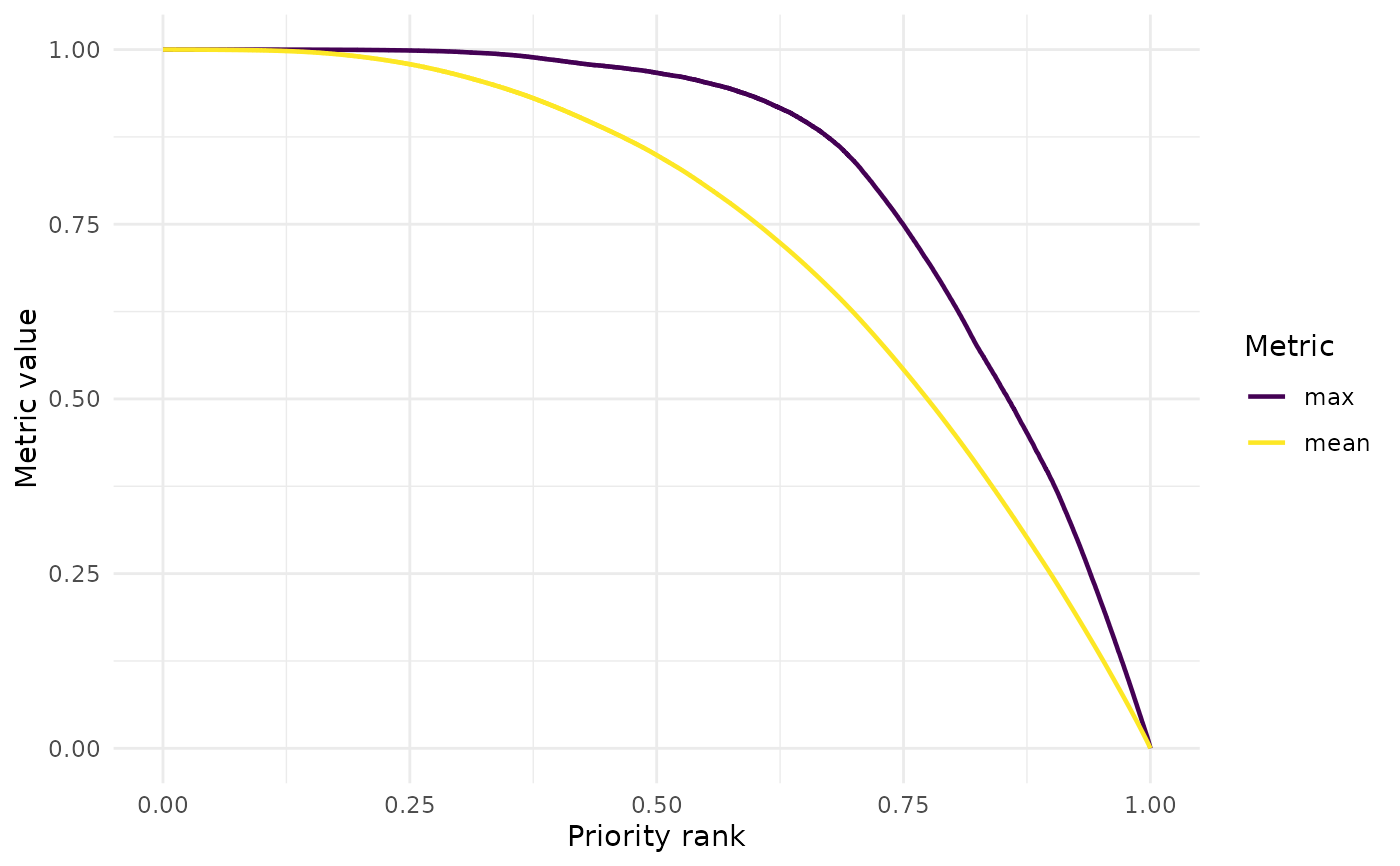
This function reads a Zonation summary curves file and plots one or more summary metrics against the priority rank. The output is a ggplot object, which can be further customized by the user. Optionally, the plot can be saved to disk as a high-quality figure.
Usage
summary_curves(
  dir,
  output_folder_name = "output",
  metrics,
  facet = FALSE,
  save_path = NULL,
  dpi = 300,
  width = 8,
  height = 6
)
Arguments
- dir
Character. Path to the variant folder containing the
outputfolder.- output_folder_name
Character. Name of the output folder inside
dir. Default is "output".- metrics
Character vector. Names of the summary metrics to plot. Metrics can be overlaid only if they share the same units and value range. Fraction-based metrics can be overlaid together, while
remaining_areaandremaining_costcannot be overlaid with other metrics.- facet
Logical. If TRUE, metrics are plotted in separate panels. This should be used when plotting metrics with different units or value ranges. Default is FALSE.
- save_path
Character. Optional file path to save the plot. The file format is inferred from the file extension (e.g. ".tiff").
- dpi
Numeric. Resolution (dots per inch) for saved figures. Default is 300.
- width
Numeric. Width of the saved figure in inches. Default is 8.
- height
Numeric. Height of the saved figure in inches. Default is 6.
Value
A ggplot object visualizing one or more Zonation summary
metrics plotted against priority rank.
See also
Other postprocessing:
cost_summary(),
coverage_distribution(),
feature_curves(),
feature_representation(),
priority_map(),
rank_similarity()
Examples
# \donttest{
withr::with_tempdir({

  data_path <- system.file(
    "extdata",
    package = "ZonationR"
  )

  dir.create("output")

  file.copy(
    file.path(data_path, "summary_curves.csv"),
    "output/summary_curves.csv",
    overwrite = TRUE
  )

  p1 <- summary_curves(
    dir = ".",
    output_folder_name = "output",
    metrics = c("mean", "max")
  )

  print(p1)

})

# }
# }